Cyber Threats Database with Computer Virus
Free TrialBackground
The database contains information on servers, their locations, connections to other servers, and when many viruses are detected on them.
Objective
- Visually see how a computer virus infects servers over time and how it spreads from server to server across large geographical areas.
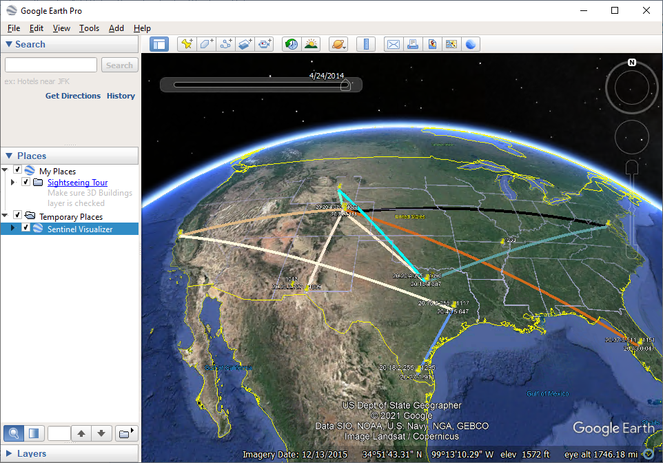
- Illustrate how Sentinel Visualizer is integrated with Google Earth to see geospatial and temporal data dynamically.
Sentinel Visualizer Analysis
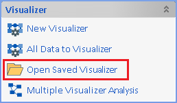
After opening the database, from Sentinel Visualizer's Home Page, click [Open Saved Visualizer].
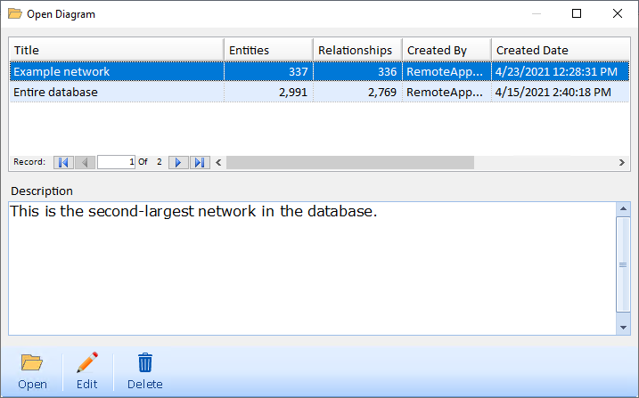
Select the diagram titled "Example Network" and click the [Open] button.
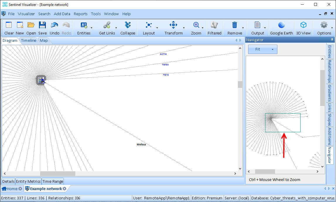
On the far right side of the visualizer, click the [Navigator] tab.
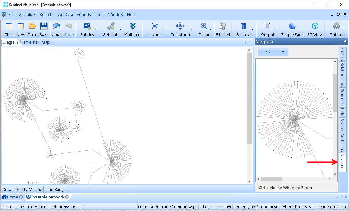
Draw a box inside the Navigator and then grab the edge of the box and move it around to display different areas of the link chart. Draw a small box to zoom-in, a larger box to zoom-out.
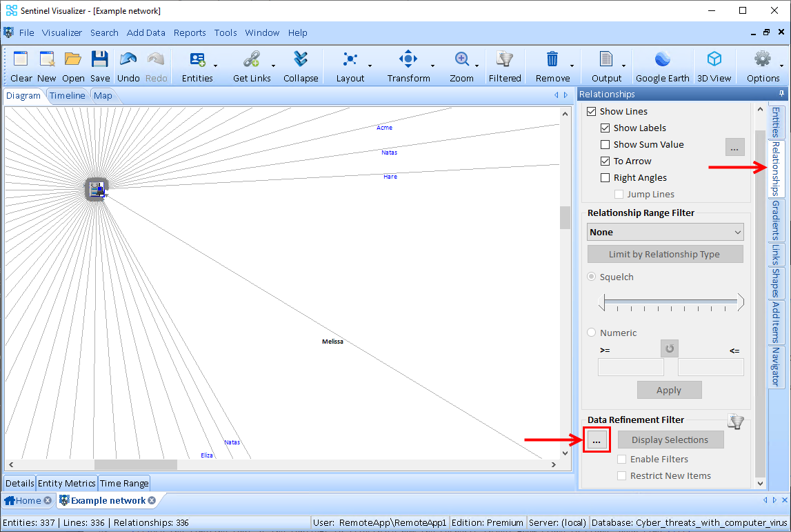
Note that many of the servers are connected by the Melissa virus. So, let’s declutter (get rid of the noise) for the Melissa virus so that we can isolate the data for that specific relationship. On the far right side of the visualizer, click the [Relationships] tab. Click the ellipsis in the 'Data Refinement Filter' section.
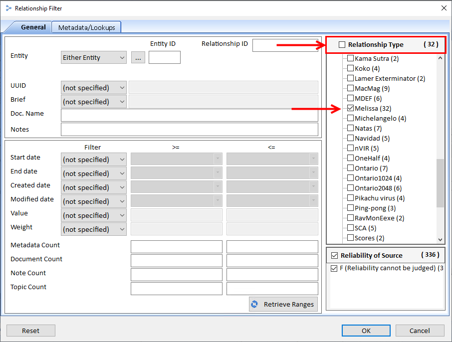
Uncheck the 'Relationship Type' box at the top and then scroll down until you see Melissa. Check that box and click [OK].
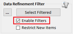
In the 'Data Refinement Filter' section, check the [Enable Filters] check box.
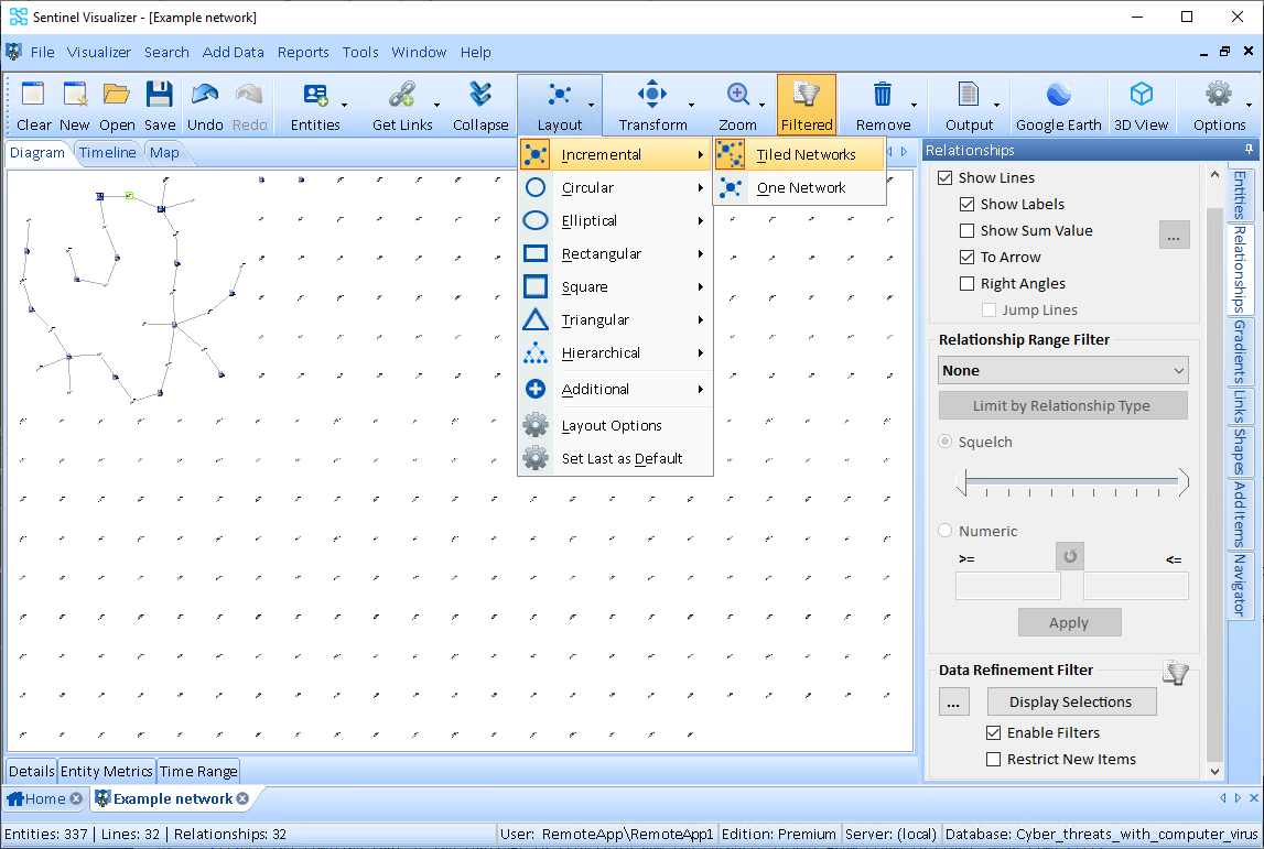
Redraw the Layout to Incremental. On the Visualizer toolbar, select the [Layout] drop-down. Select [Incremental] and click [Tiled Networks]. Zoom in to view the chart more closely. Note how the computers are connected to various servers.
This database has location-specific information, you can send the chart out to Google Earth. Click the Google Earth icon on the toolbar to view the geospatial mapping of your link chart. (Google Earth must be installed on your computer.)
