COVID-19 Contact Tracing
Free Trial Background
Contact Tracing is critical to minimizing the spread of COVID-19 in your community. Coronavirus infections are particularly dangerous to vulnerable populations such as retirement homes, elderly family members, medical providers, and front-line service personnel. By collecting and managing the data of your population, you are prepared when an outbreak occurs to quickly isolate and quarantine people who are in contact with infected individuals and minimize the transmission of this highly contagious disease.
Objective
The objective of contact tracing is to quickly identify outbreaks to test and quarantine the people who are involved without burdening the rest of the population.
Instead of shutting down an entire school, we want to identify the source of the virus and the students who can stop the spread. Done quickly, only a small group is inconvenienced and receives the help they need, while others are not so restricted.
Analysis
Contact tracing analysis is not always a single path. One needs to follow the data with multiple sets of analysis to see the big picture, investigate outbreaks, look for hidden relationships and other information unique to the community to isolate the infected and exposed people.
Here we show how its done through three analytic paths. The first two reveal key information that helps us understand the likely path of infections and leads us to the third analysis that gives us the contact tracing list.
- Analysis #1: Entire Student Network and Infected Students
- Analysis #2: Analysis from the Infected Students
- Analysis #3: Who are Most Closely Linked to the Infected?
Objective
See the entire school network and the infected students.
Sentinel Visualizer Analysis
Link analysis software reveals connections, relationships, and patterns within your data. Sentinel Visualizer can be used proactively and reactively for COVID-19 contact tracing.
On the Sentinel Visualizer Home Page, click [All to Visualizer].

In preparation for contact tracing, information on all the students and staff are collected. Their courses, class locations, teachers, grades, clubs, siblings, etc. There are lots of different connections among the people.
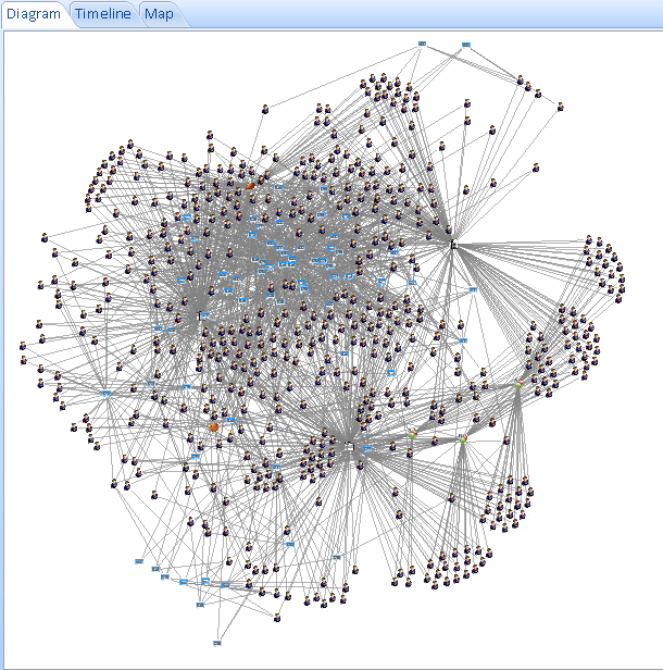
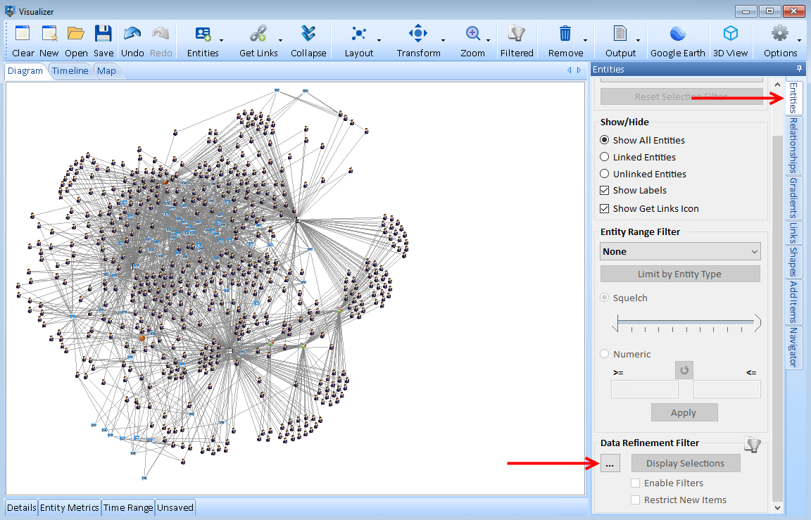
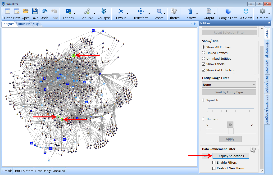
Sentinel Visualizer lets you set the Infected metadata of those people, and highlight them in color to see them across your network. In the [Entities] tab, select the [...] in the Data Refinement Filter panel.
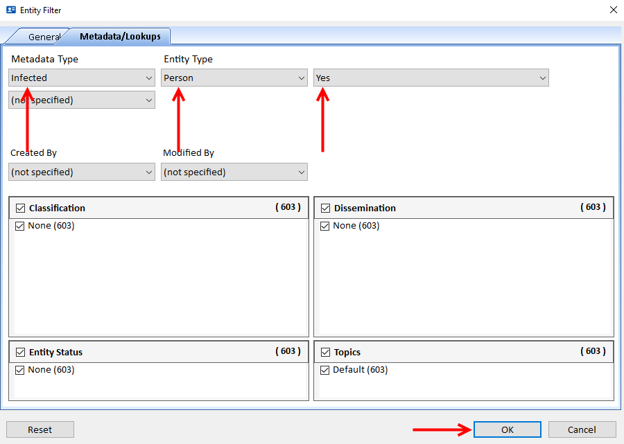
Click the [Metadata/Lookups] tab. In the Metadata Type drop-down, choose Infected. In the Entity Type drop-down, choose Person, then Yes and click [OK].
Click the [Display Selections] button. Oh No! Three students report positive test results for COVID-19. Sentinel Visualizer lets you set the Infected metadata of those people, and highlights them in green to see them across your network.
Preliminary Results
Unless everyone is tested at the same time, when positive test results are reported, we must assume others who were not tested recently are positive and asymptomatic carriers who did not get tested.
- Did the infected get exposed together or separately?
- Is there a larger outbreak?
- What do they have in common?
- Do we need to shut down the whole school?
- Are there relationships we haven't captured for our contact tracing?
Of course, you need to interview each of the infected to see if they know how they were exposed and their contacts. But often people don't know. Sentinel Visualizer lets you proactively discover relationship that already exist and pathways people may not realize they have.
Objective
Find any shared links among the infected students.
Sentinel Visualizer Analysis
Rather than starting from everything in the first analysis, we start with the students who tested positive for COVID-19, then build the network from them.
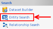
On the Sentinel Visualizer Home Page, click [Entity Search] located in the Search panel.
Click the [Advanced] button.

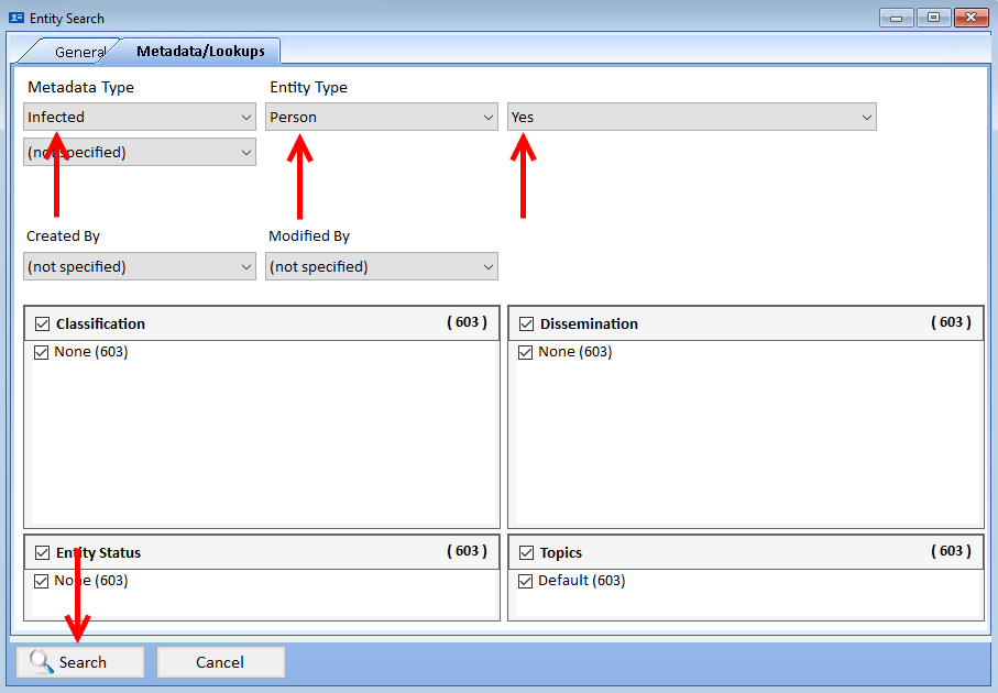
Like the previous analysis, click the [Metadata/Lookups] tab. In the Metadata Type drop-down, choose Infected. In the Entity Type drop-down, choose Person, then Yes and click [Search].
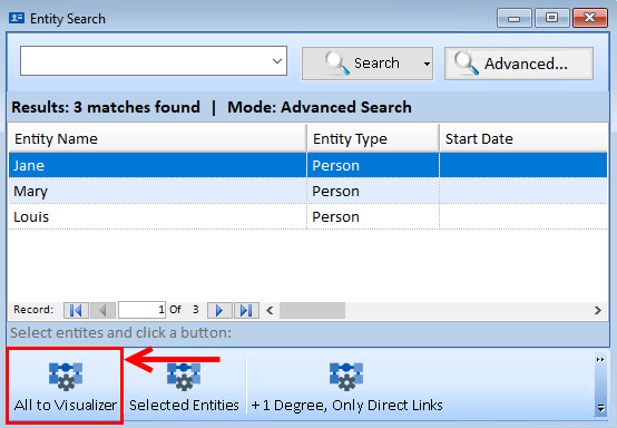
Sentinel Visualizer displays the three students who tested positive for COVID-19. Click [All to Visualizer] located at the bottom of the Entity Search page.
The three infected students are displayed on a diagram in the Visualizer:
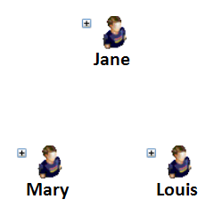
Click on the diagram and press [Ctrl + A] to select all entities. The selected entities are highlighted in green.
Click the [Get Links] button on the toolbar and select the Only Add Direct Links option. In this case, there aren't any direct links between them.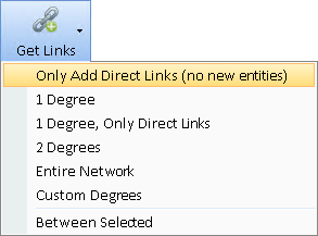
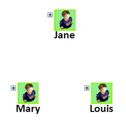
Let's go out one degree to see if the students have relationships with any common entities. Click the [Get Links] button on the toolbar and select 1 Degree.
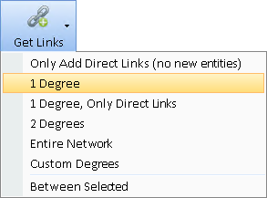
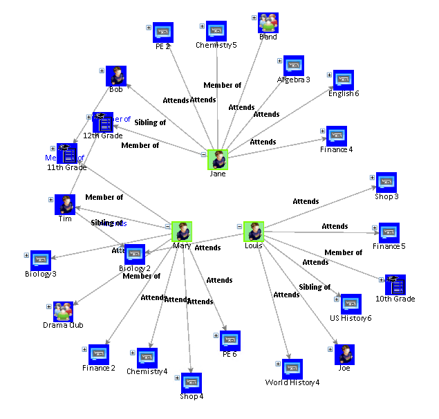
With One Degree, we can see each student's classes and clubs. We notice they don't have any in common. Only one is in Drama, one in Band, etc. If they shared something in common, that could be the source of the infections. They aren't even in the same grade. Two have siblings in the same grade as one of the other infected students, but nothing else in common.
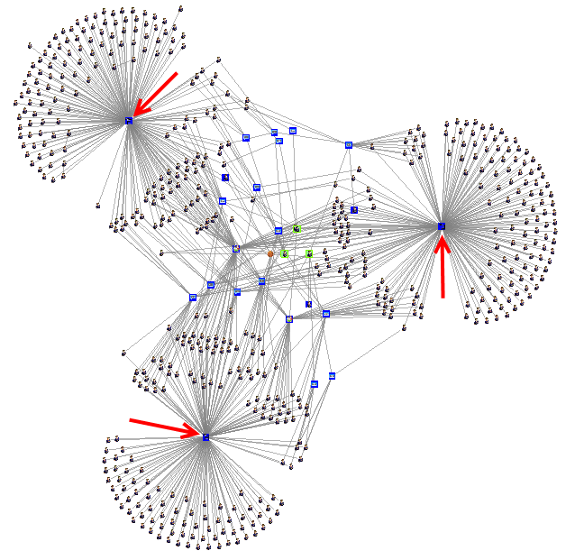
With Get Links for Two Degrees, we expand the network to another level. But it basically includes the entire school implying everyone should be tested and/or quarantined.
As we look at the diagram, we notice that three entities have many people connected to them.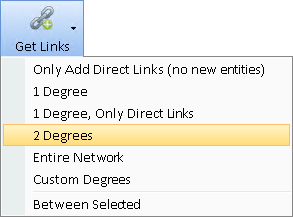
Results
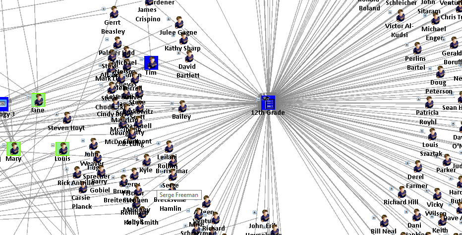
On closer inspection, we discover they are Grades. All students are linked to a grade which is data one may expect in the database, but unlike a classroom, would not cause the spread. We need to exclude Grades which is shown in Analysis 3.
Objective
Find the closest links to the three infected students so that they may be tested and quarantined.
Sentinel Visualizer Analysis
Now that we have seen the big picture, restart our visualizer diagram with just the three infected students. To do this, click the [Home] tab located at the bottom of the page.

On the Sentinel Visualizer's Home Page, click [New to Visualizer].

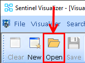
On the Visualizer toolbar, to open a diagram, click [Open].
Select the diagram titled Infected Students and click the [Open] button.
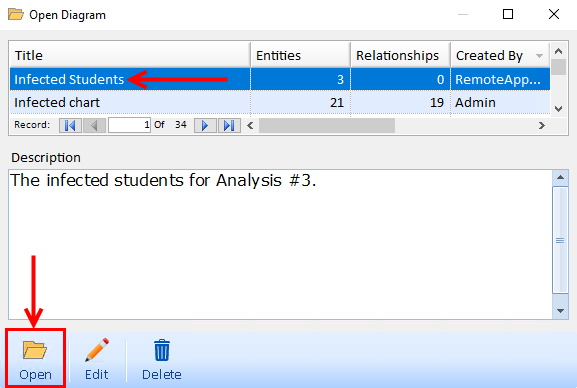
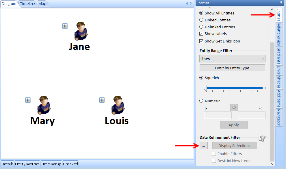
The three infected students are displayed on the diagram in the Visualizer. Exclude the Grades by using the Entity Data Refinement feature. This doesn't impact the data in our database, just the data we're retrieving.
Click the [Entities] tab and select the [...] in the Data Refinement section.
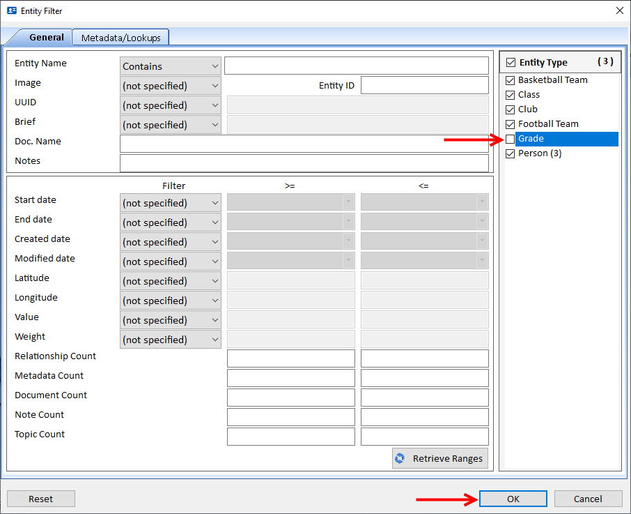
Uncheck the Grade box and click [OK].
Check the Restrict New Items box and click [Display Selections]. This will select the three entities.
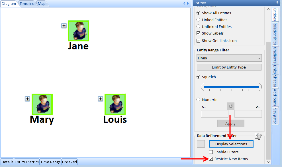
Click the [Get Links] button on the toolbar and select [Between Selected]. Between Selected allows you to select multiple entitles to add the fewest entities and relationships connecting them.
Click [Yes] to have the Data Refinement Filter applied and only items passing it added to the diagram.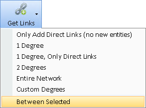
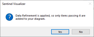
Select the 'Least number of entities to connect every pair' option and click [OK].
Selecting the three students and applying the powerful Get Links feature Between Selected adds the entities and relationships that are the closest links among the three of them.
According to the data, the new entities are a few degrees apart from two or more of the infected.
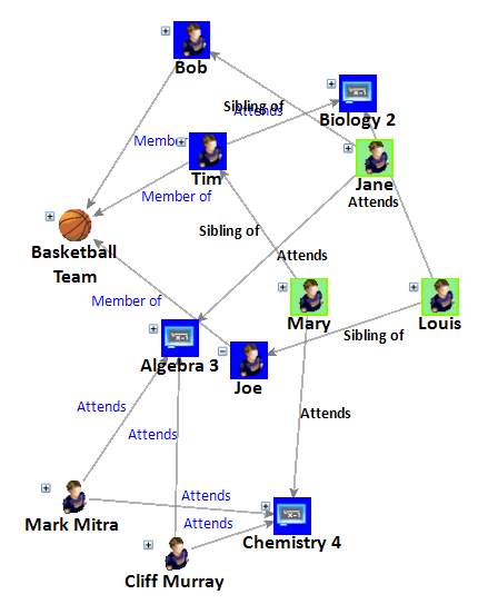
Sentinel Visualizer offers a variety of automated layout functions that make it easy to quickly organize networks into different configurations. Visit Sentinel Visualizer's Layout Options for more choices.
Click the [Layout] drop-down on the toolbar, select [Incremental] and click [Tiled Networks] to see the network more clearly.
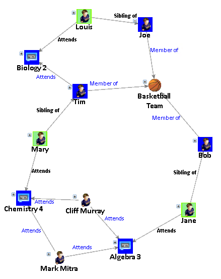
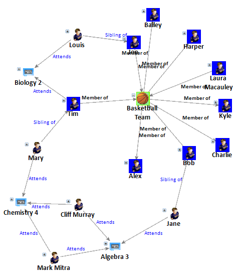
We can see two students (Cliff and Mark) both attend a class that includes one of the infected students (Mary and Jane), but not the third (Louis). More significantly, each of the infected students has a sibling who is a member of the basketball team! Sentinel Visualizer quickly revealed all three infected students are linked to the basketball team by two degrees. That mutually common connection is the most likely source of the outbreak.
Select the Basketball Team and on the Visualizer toolbar, click [Get Links], [1 Degree] to add everyone connected to the team.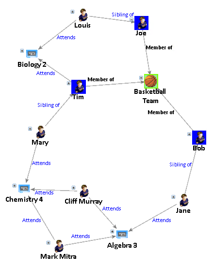

Results
Based on this analysis, in addition to isolating the infected and their siblings, the basketball team should be tested and quarantined until the results come back.
Export the List of Contact Tracing List of Students and Entities to Microsoft Excel
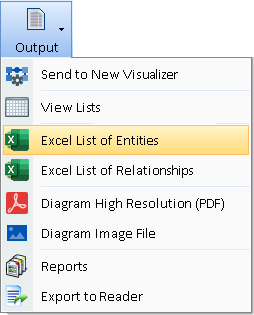
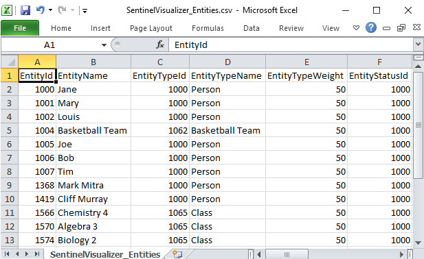
Quickly focus your efforts to stop the spread and easily export the entities on your diagram into an Excel spreadsheet by clicking [Output] on the visualizer toolbar and select [Excel List of Entities].
|
 |


