Link Analysis Overview
Free TrialWith Microsoft SQL Server, Sentinel Visualizer supports millions of entity and relationship records. Send all your data to the diagram or use search features like the Dataset Builder and Advanced Dataset Builder to select a subset of data for your link chart. Pick entities and relationships by their specific characteristics and links to each other. You can start big and drill down to details, or expand from individual entities one degree at a time until you include their entire network. Thousands of data points can be added to your diagram in a highly optimized, scalable, and shareable manner.
School Contact Tracing Network of Students and Staff

Multiple Disconnected Networks, Side-by-Side from Largest to Smallest

Thousands of Connected Phones

Multiple Circle Layout

Once your data is on the Visualizer Diagram, a wide range of tools are available to customize and perform additional analysis. Here are some of the options on the panels:
Save, Share and Merge Diagrams
You can save your diagrams into the database to retrieve them in the future. They can be shared with other authorized users or kept private to yourself. You can also merge saved diagrams into your current diagram to combine multiple sets of analysis.
Rather than dumping all the data and finding the relationships, you can start with one entity and build from there. Use the Get Links feature to add to its network. You can expand it by the number of degrees (its links, the links of its links, etc.). When links are added the links among the entities are also displayed. You can also use the Entire Network feature to load all the connections related to the entity no matter how many degrees away they are.
Start with One Entity

Get Links One Degree
 Notice two of the entities are also connected to each other
Get Links Two Degrees
 Entities connected to the one-degree entities
Get Links Entire Network
 All the connected entities
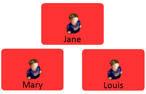
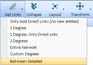
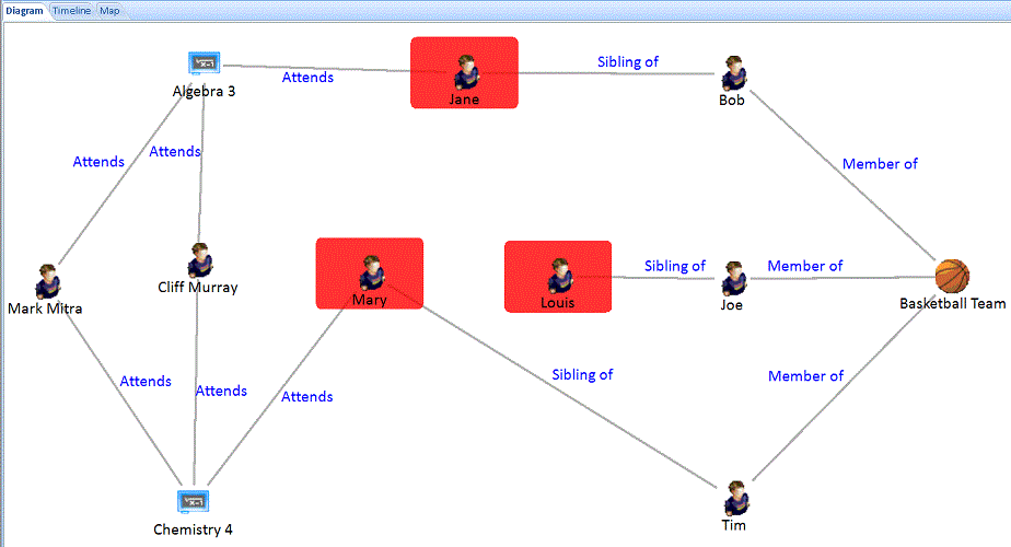
The Between Selected feature lets you select multiple entities to add the fewest entities connecting them. Discover the smallest, tightest network among them.
For example, for Contact Tracing, three students tested positive. Between Selected quickly identifies the shortest path between them.
Combined with Data Refinement
Data Refinement lets you filter the type of Entities and Relationships on your diagram.
When data refinement is applied, Get Links respects those settings and only retrieves the entities and relationships that pass the filters. Easily focus on the data you want while excluding irrelevant data.
Sentinel Visualizer lets you apply advanced Link Analysis visualization to reveal the hidden relationships in your data. Leveraging your definitions of entities and relationships among them, turn rows and columns into visual data revealing multi-level hierarchical relationships. Quickly understand hidden links among people, places and events that are nearly impossible to see in traditional data grids.
Get the trial to explore Advanced Link Charts for COVID-19 Contact Tracing.
As entities are placed on the network and their links added, you can easily see the entities they have in common. This helps you focus your limited time and budget on the most suspicious and highest value targets.
Try the trial to identify the Common Linked Entities in the Telephone Call Records Analysis exercise.
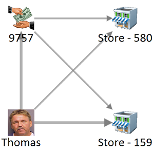
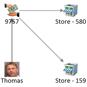
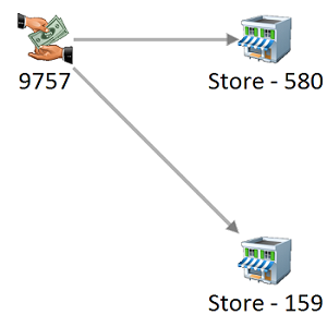
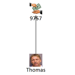
In the Visualizer diagram, Get Link is a powerful way to understand related data. Get Links, 1 Degree adds all the entities with relationships to an entity. There are four options to add All Links, Only Direct Links, Only FROM Links, or Only TO Links. This is useful if you want to see flows like money in a particular direction.
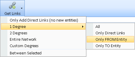 Get Links, 1 Degree with 4 Options
The Relationships panel offers options to customize the display of the lines on your diagram. Optionally display labels, sums, arrows, and whether the lines should be straight or angled.
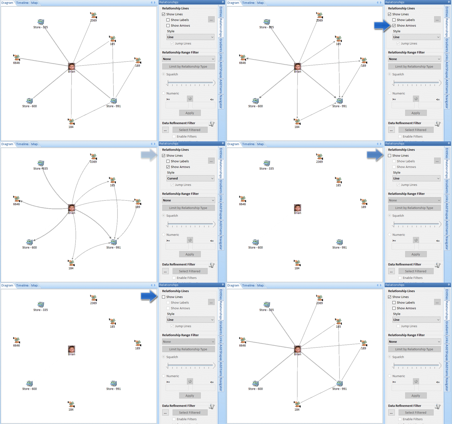 Relationship Line Arrow and Styles: Line, Right Angle, Curved
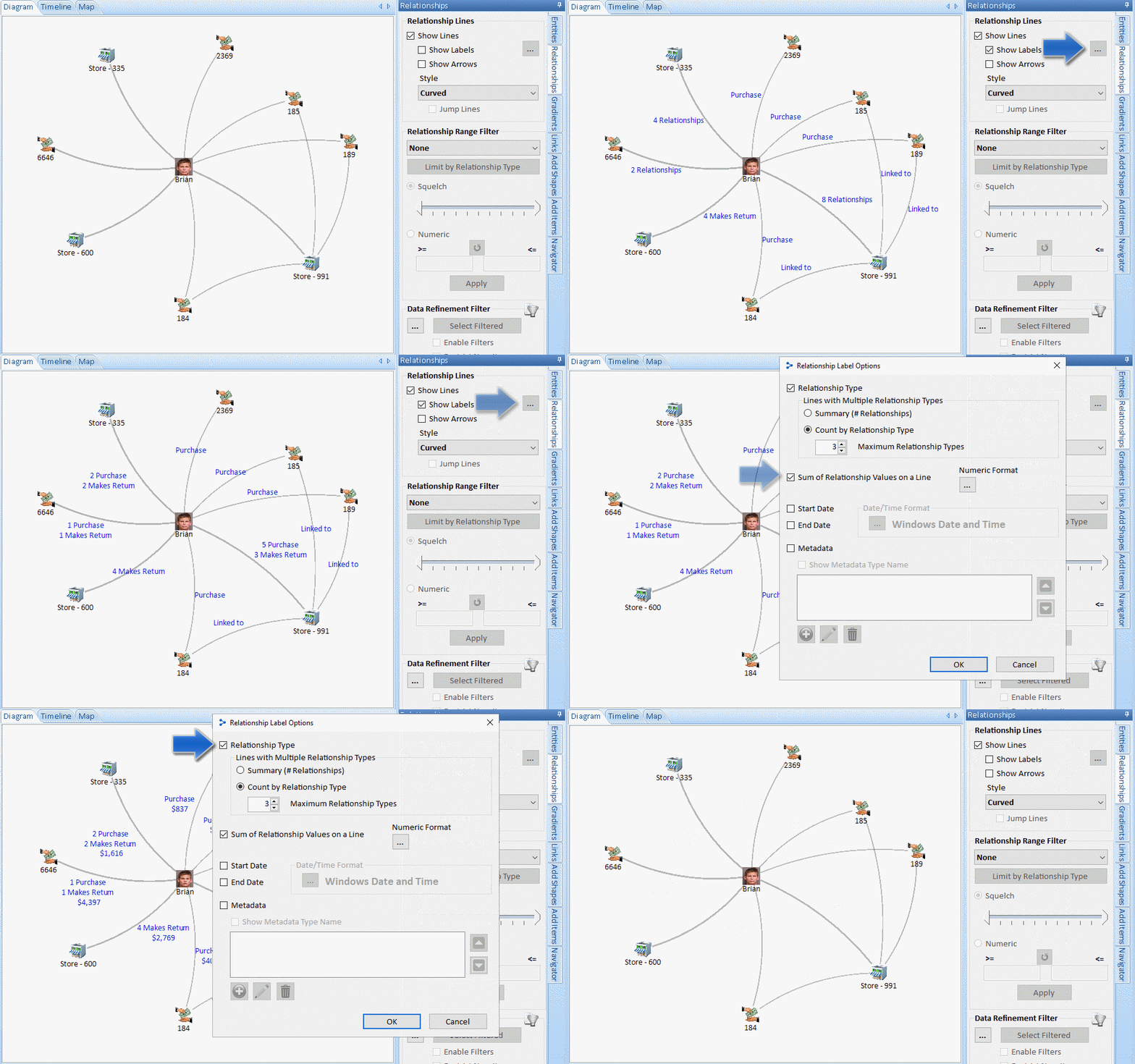 Relationship Label Options to Show Summary and Details
A variety of options are available to format numbers and dates.


