Data Visualization with Sentinel Visualizer
Free TrialInterconnected data is difficult to understand using traditional tools. Sentinel Visualizer provides advanced visualization surfaces to help you find meaning from complex information.
- Find hidden relationships
- Identify clusters and patterns quickly
- Perform ad-hoc analysis, and test theories and scenarios
- Organize complex networks into manageable groups
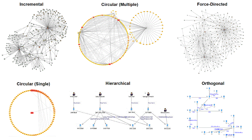
Sentinel Visualizer provides a variety of automated layout functions that make it easy to quickly organize networks into different configurations. Layouts include incremental, hierarchical, circular, elliptical, rectangular, square, triangular, orthogonal, and force-directed. Entities can also be grouped by their entity type.
Additional options control the entity sort order, multiple network displays, and other customizations.
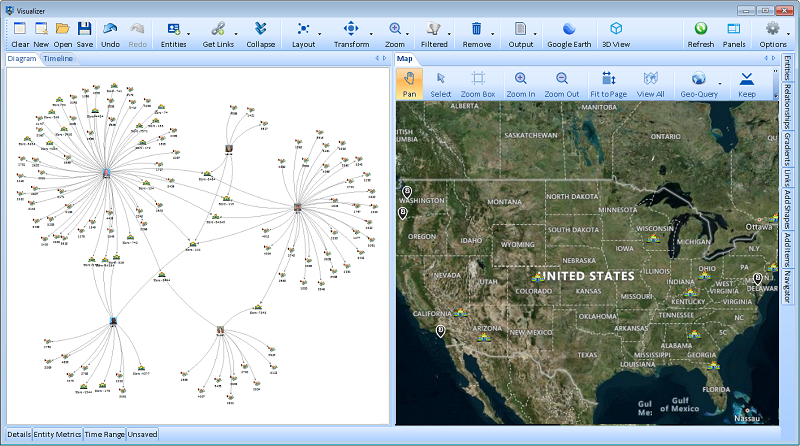
Entities with latitude and longitude values can be shown automatically on a map with its custom icon. Filter the network view by geographic area or use the Geo-Query to find new data by geographic location.
Sentinel Visualizer includes online maps with topography and road styles, so you can zoom to any part of the world. Also includes integration with Google Earth and support for offline maps, ESRI and shape files. There are settings, and output for printing and graphic export files.
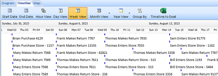
Only Sentinel Visualizer provides timeline views of data and dynamic time Sliders. The Timeline view shows all entity and relationship start/end date/time data in a scrollable view, making it easy to view events, overlapping periods, and other time-based patterns.
The unique Time Slider allows you to define a time window and move the Slider back and forth to see how the network data changes over time.
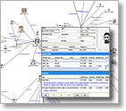
Since the visualization surfaces are directly connected to your knowledgebase, you have immediate access to comprehensive information about any object in the network.
Click on an entity and display comprehensive narrative and metadata content. The Details pane provides quick access to the key data points for entities and relationships.
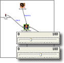
The visualization tools allow you to quickly filter for specific data or remove incomplete data and noise. Filters let you control exactly what entity and relationship data you want, and easily switch between different views. Use the Squelch control to dynamically hide low-value data based on variety of criteria.
For example, you can link a Slider to information credibility. As you move the Slider, only highly credible data is shown. Since Squelch is a dynamic feature (the chart changes as you move the Slider), you can quickly see patterns and groups that were previously hidden.
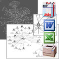
Sentinel Visualizer lets you turn your work into sophisticated reports and presentations. Save diagrams and "what-if" analysis for sharing within your team, with titles and narratives to describe your work. Sentinel Visualizer handles all security issues.
If your diagram includes secure information, only users with appropriate permissions can view it. You also can share knowledge externally with a variety of reporting and exporting options: print diagrams and customized reports, or export them in image, PDF, Word, Excel, or web page format.
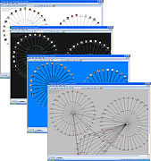
Sentinel Visualizer offers user-configurable display properties for the graph view of networks. In addition to the default display style, you have complete control over colors, icons, pictures, line widths, alpha-transparency, and a host of other parameters.
Visual Styles can be named and saved, allowing users to maintain a set of favorite styles each optimized for the task at hand. For example, you could employ the standard configuration for viewing networks at 100% zoom level, or a high-contrast configuration for working with very large networks.
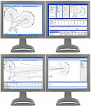
Sentinel Visualizer includes the ability to work with more screen real-estate while using the Analyzer to view and analyze networks. This is accomplished with direct support for multi-monitor displays, along with and the ability to move, dock and resize any of the toolbars. You can even move toolbars to a second monitor to maximize the screen area available for viewing larger networks.
